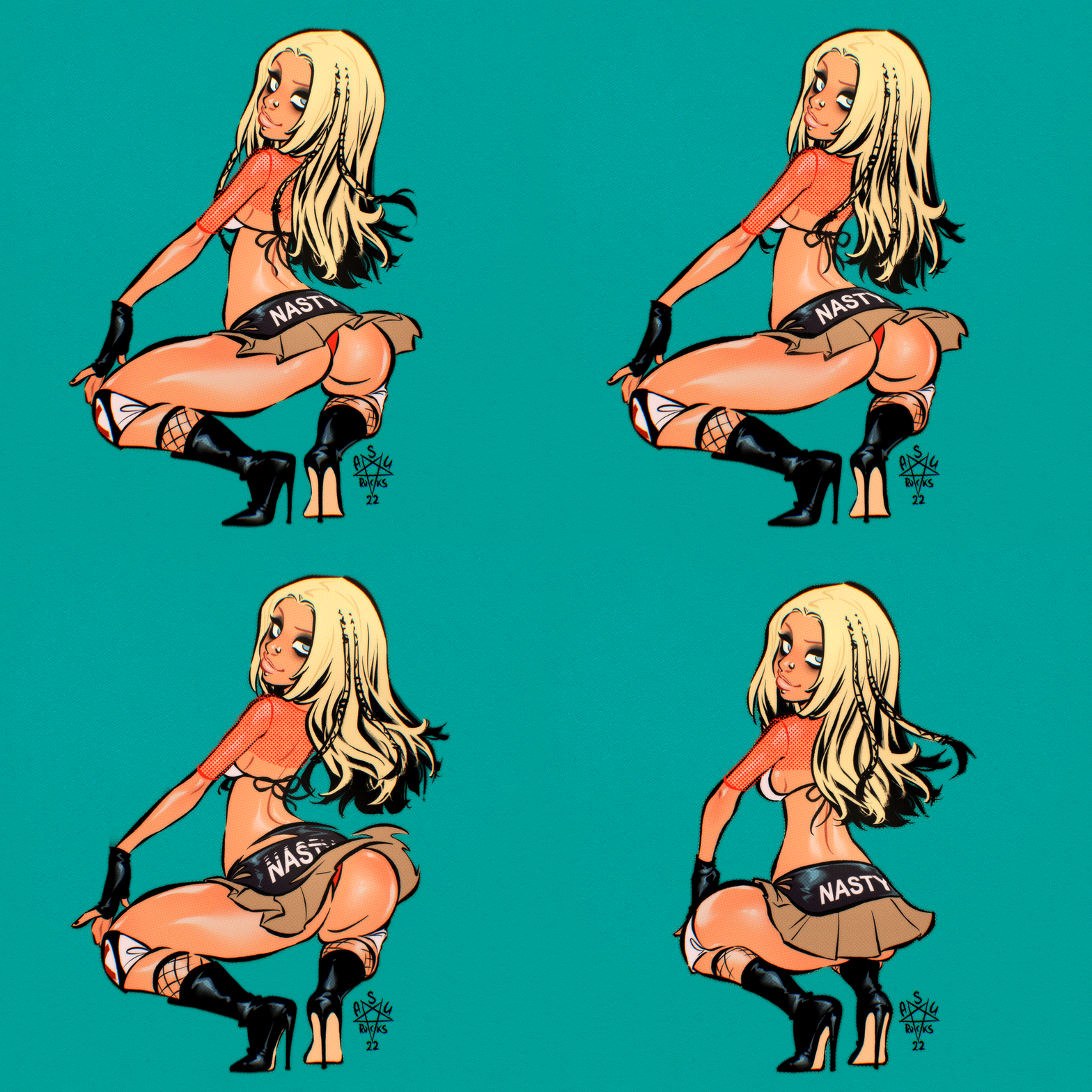
Recently some friends and I had some mulled wine and started remembering our fascination with music videos back when we were teens and MTV still was showing music videos. We talked about the weird 2000s fashion, the loooooong bare midriffs and the weird horny feelings some of those videos gave us. These days one might call it “bisexual awakening”. 🤣
Remembering those made me want to draw some of the 2000s ladies that had the biggest impact on me. And pretty high on top of this list was of, course, Dirrty era Xtina! These days the music video might not shock anyone much, but back in 2002 those assless chaps and the almost nonexistent miniskirt were mind blowing. And horny teenaged me could not stop watching. XD
I first finished this drawing with the iconic chaps:
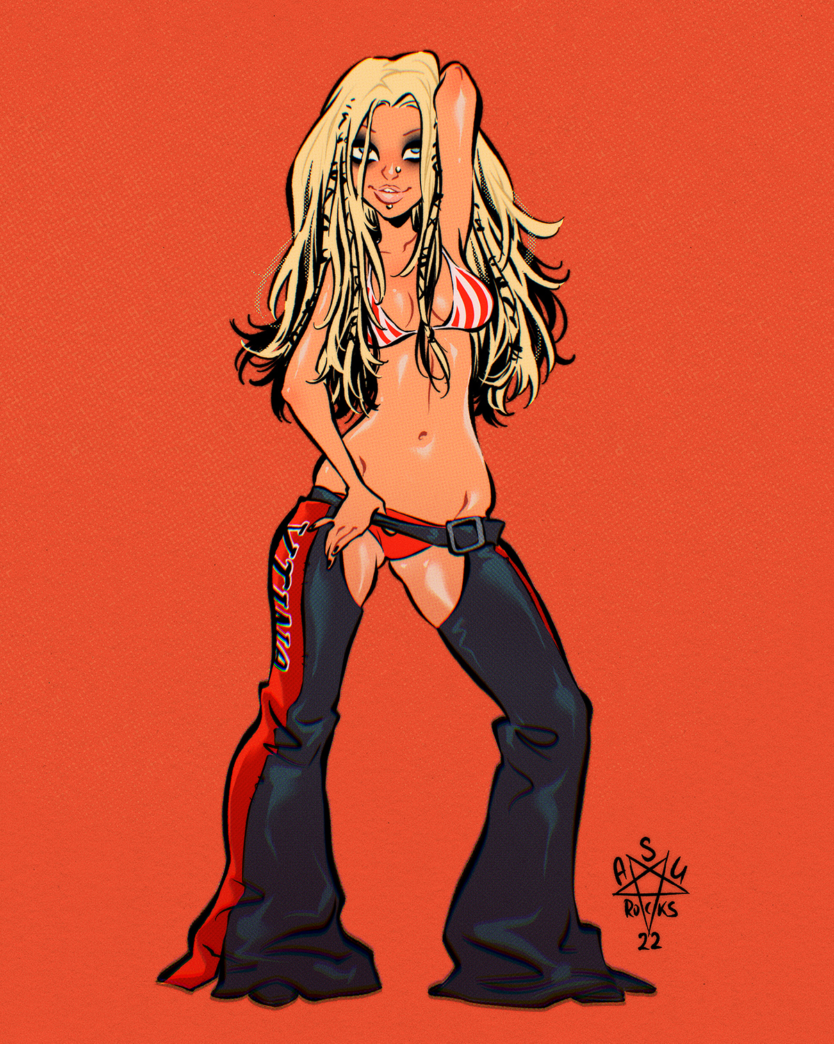
I had SO MUCH fun drawing her, for some reason. Probably in part because it was absolutely pointless: not for a job or anything terribly useful. Just for fun! I feel like I almost forgot how to do art just for fun. And also probably because 2000s fashion makes me weirdly happy. It was SO BAD and SO GOOD at the same time.
Since I enjoyed myself so much, I decided to do another drawing of her, but this time it had to be animated.
In this post you can see how I did it.
[ppp_patron_only]
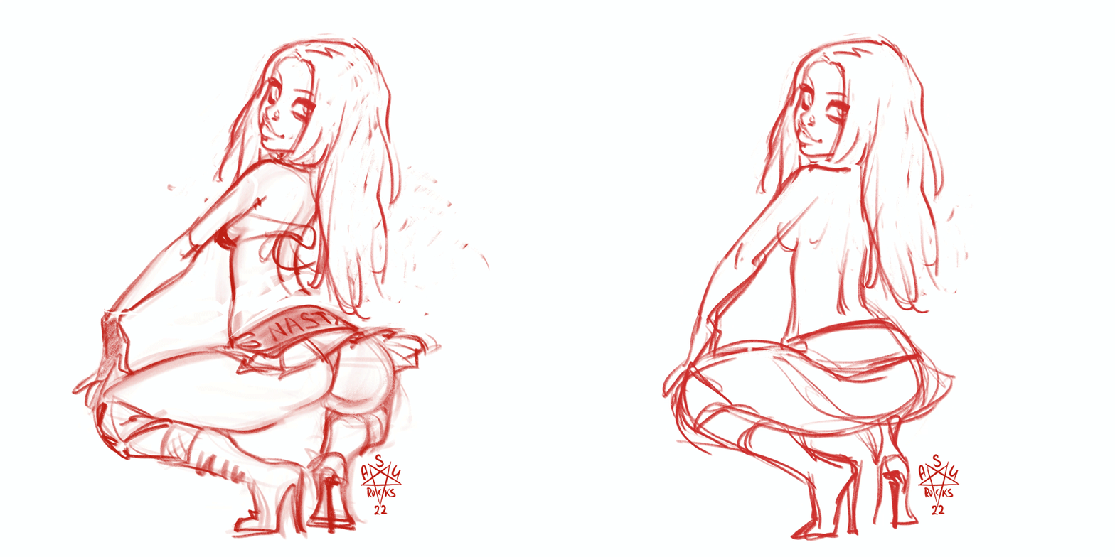
So I started with this sketch of one of the dance moves from the video.
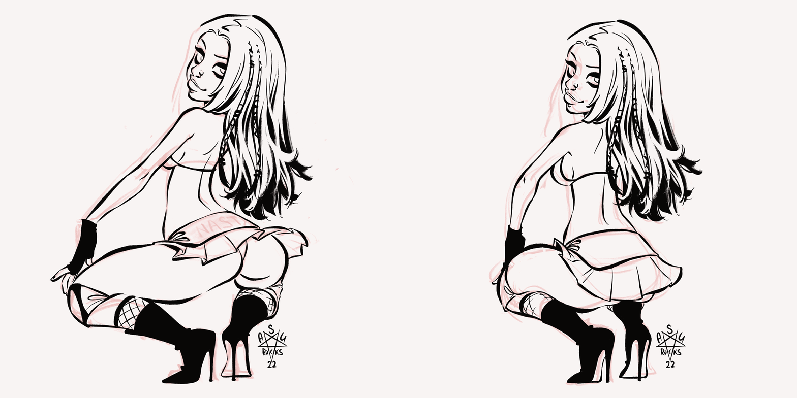
I drew lines pretty early on, because I like to think in lines.
My goal was to keep it doable, which meant keeping the amount of frames I had to draw to a minimum. 2 were definitely not enough. I would need at least one more and it would be an important one:
THE SMEAR FRAME!
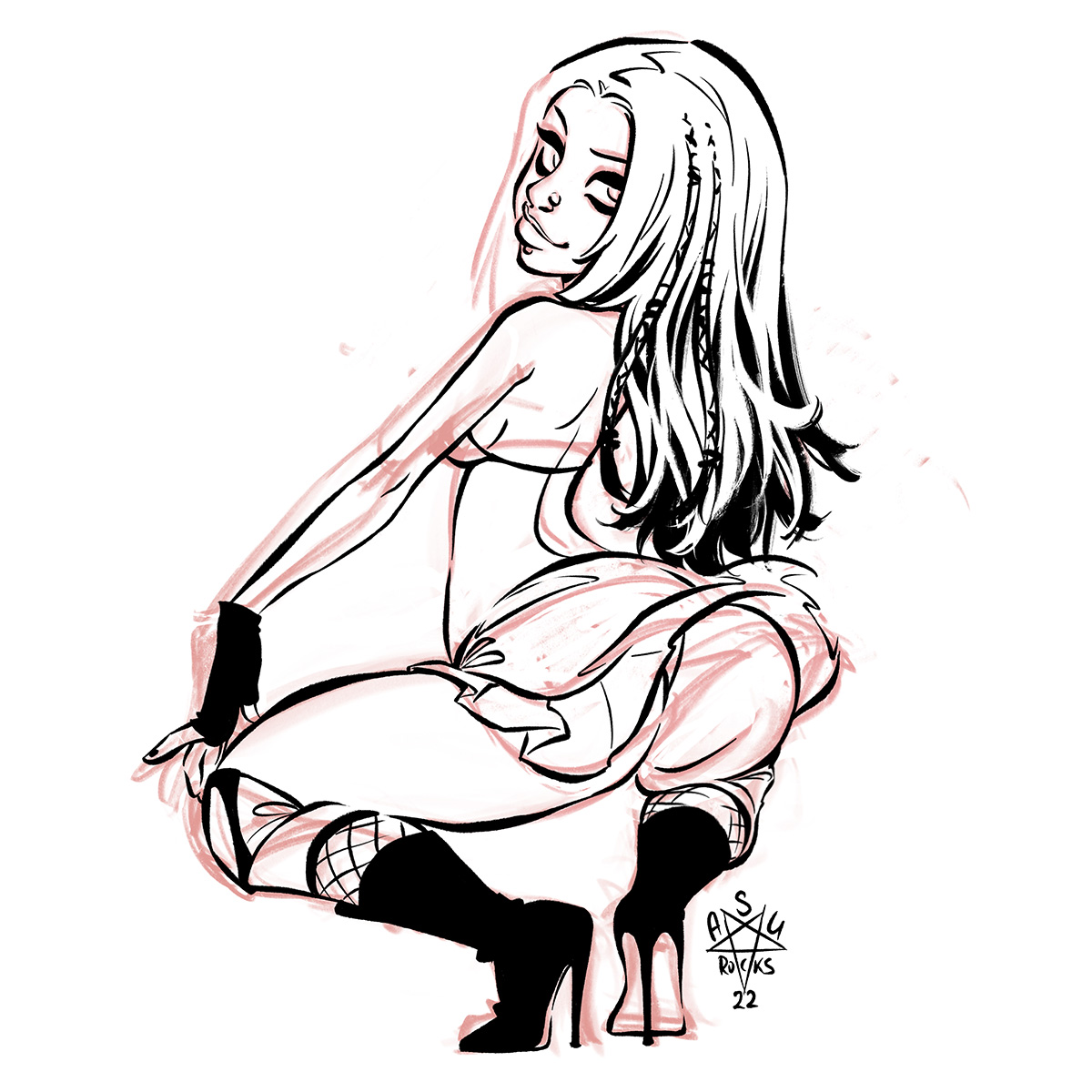
Smear frames are used to exaggerate fast movement in animation. When you sometimes pause an old-school animated movie and the character looks weirdly stretched or deformed, it’s probably a smear frame. They are fun to draw because they can be ridiculously ugly. But they are also not always easy to do right. I experimented a lot for this butt smear! Not the most beautiful butt on it’s own, I would say…
But added between the frames it adds a ton of movement:

This almost works already, but I added one more frame to make the whole thing “bouncier”. It’s a slight variation of the first frame:
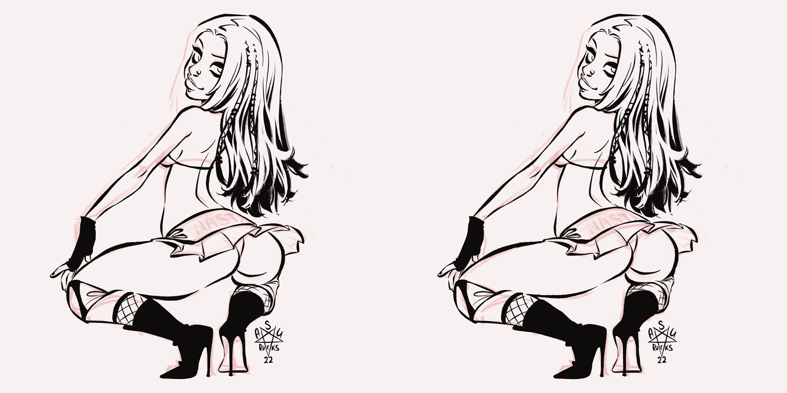
It slightly prolongs the “butt up”-part of the animation and adds a subtle movement. It just looks more fluid and JUICIER in the end:
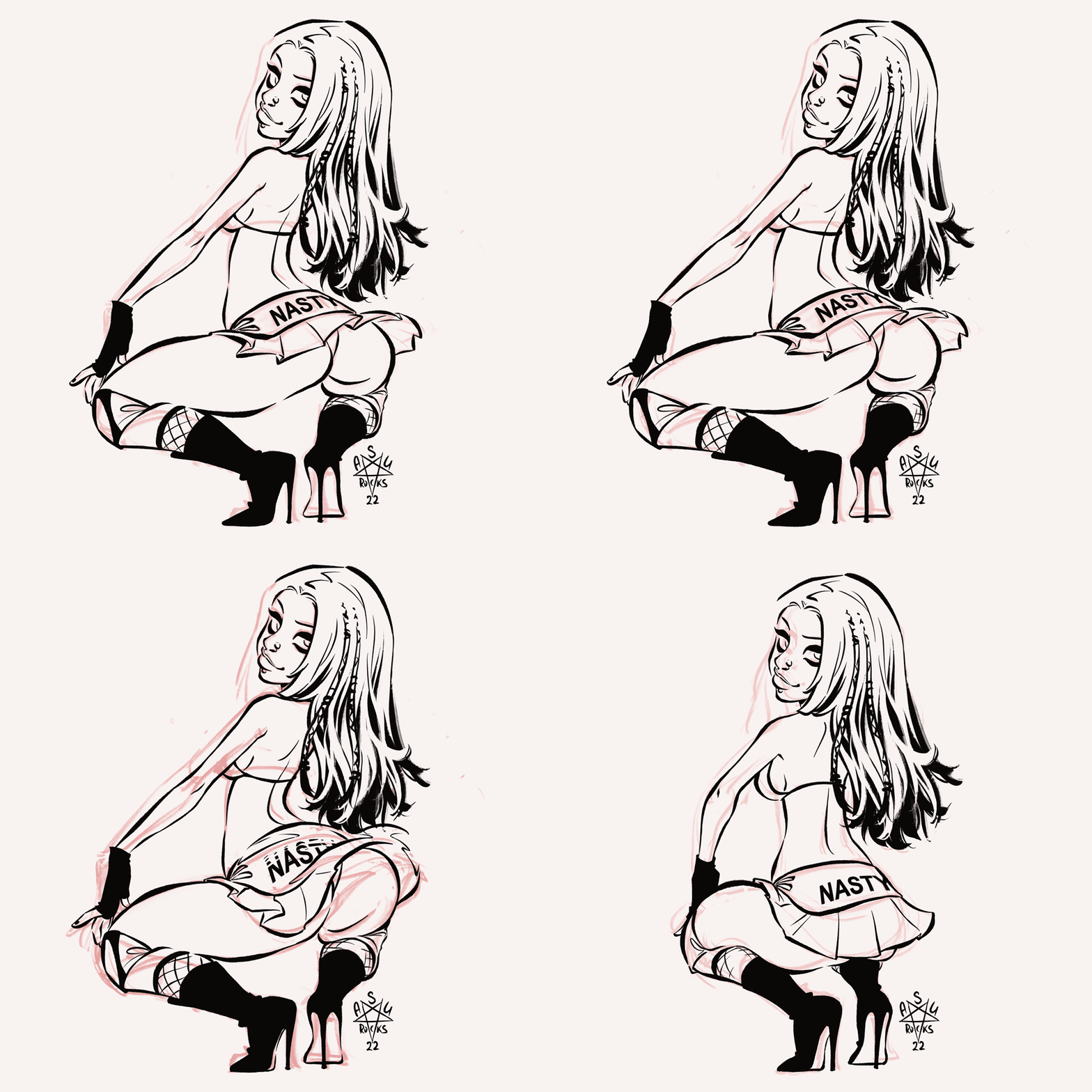
That’s it! I don’t want to draw any more frames! Somebody (me) has to color all of them. 😅
Starting out with the color I also have to take care of another animated part: the hair. So far it has only been copy-pasted from one frame to the other, but that’s a bit too boring. On the other hand I also did not want to redraw it for every frame.
So I colored the face and hair first, copied them into all frames and used transform and liquify tools to make it follow the movement:
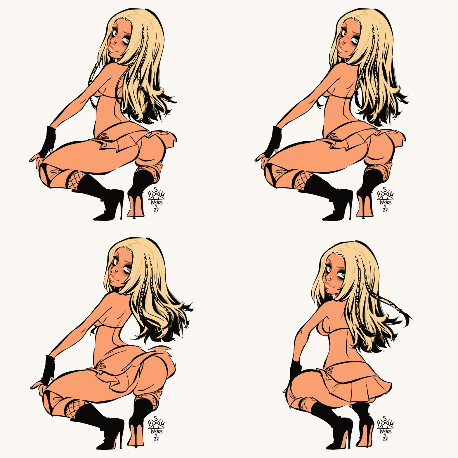
Much better!
Now I “just” needed to color all the frames. (It took almost a day)
Here’s a breakdown of all the coloring steps:
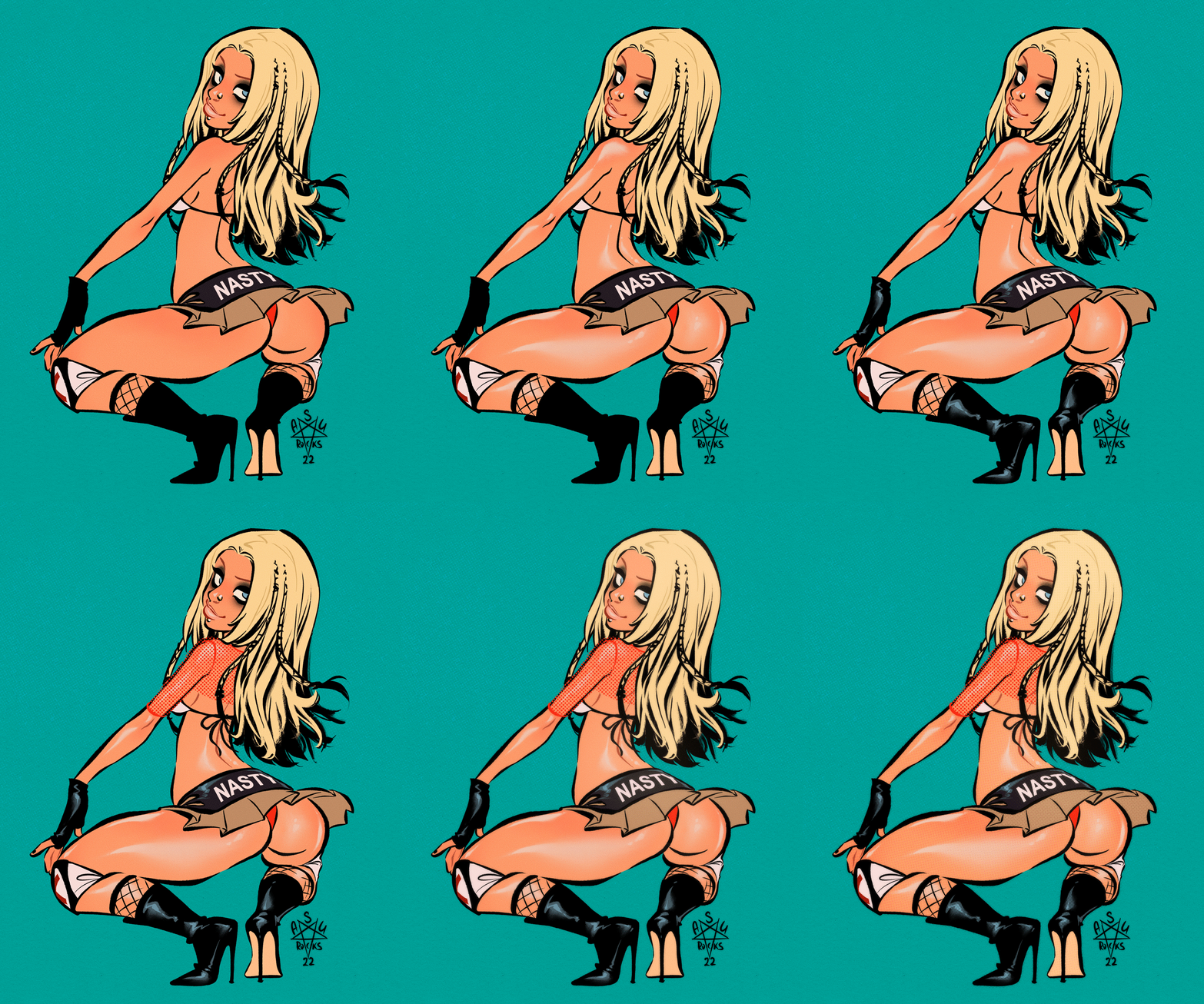
The skin shine was the trickiest part to figure out so that it does not bounce weirdly in the animation. There was A LOT of redrawing and transforming involved until I was happy with it.
In the end I added her transparent top, the bikini top ribbon and some effects and VOILÁ! A bouncy butt animation you can’t stop staring at!

That’s it! I hope you enjoyed this deep dive and now all have “Dirrty” stuck in your heads.
Here’s a bonus sketch that didn’t make it to a finished illustration:
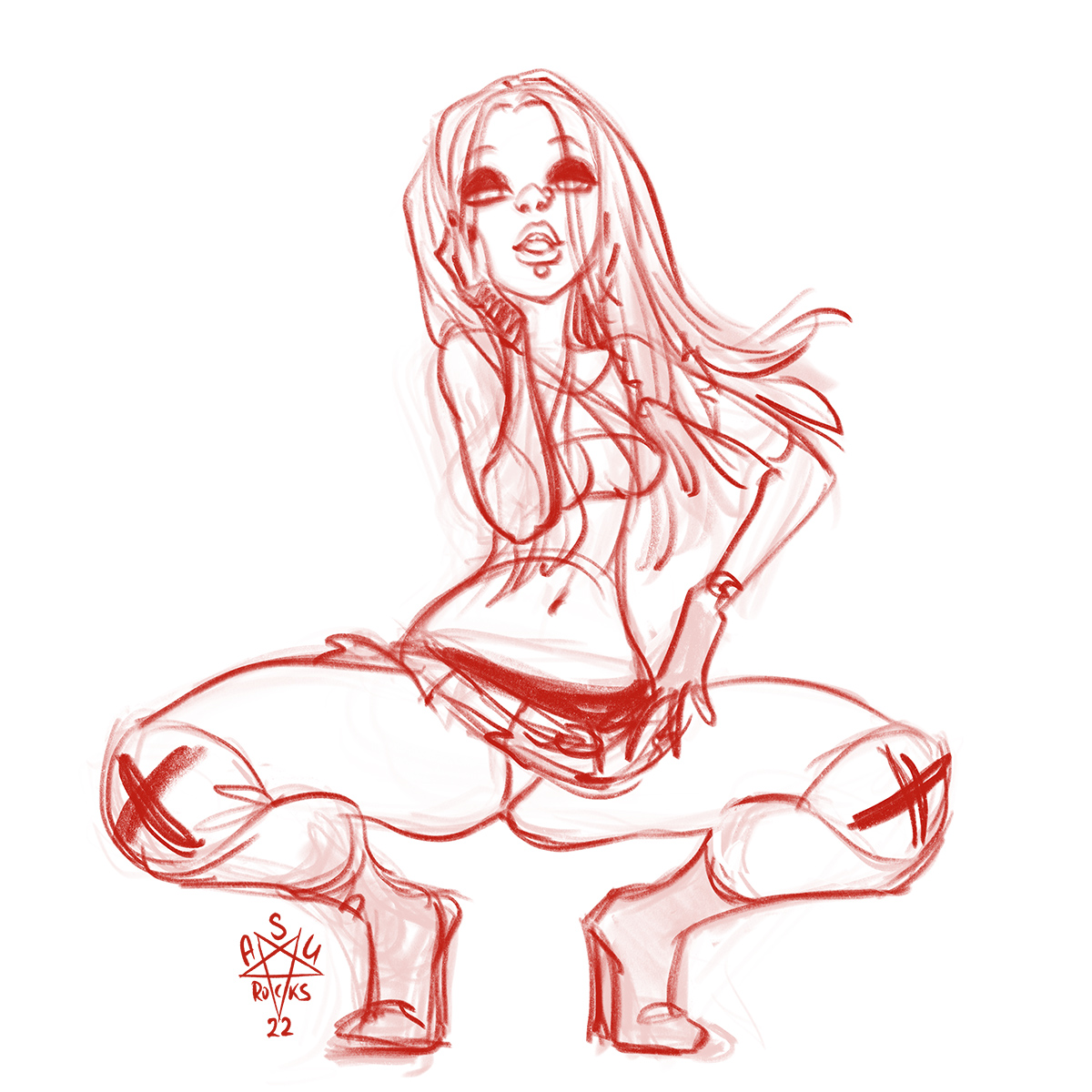
Do you have nostalgic feelings for old music videos? Which ones?
Which 90s/2000s pop ladies would you like to see animated if I have this mood again?
…
okay.
…
SPOILER ALERT.
…
I already decided who I will draw next.
Can you guess?
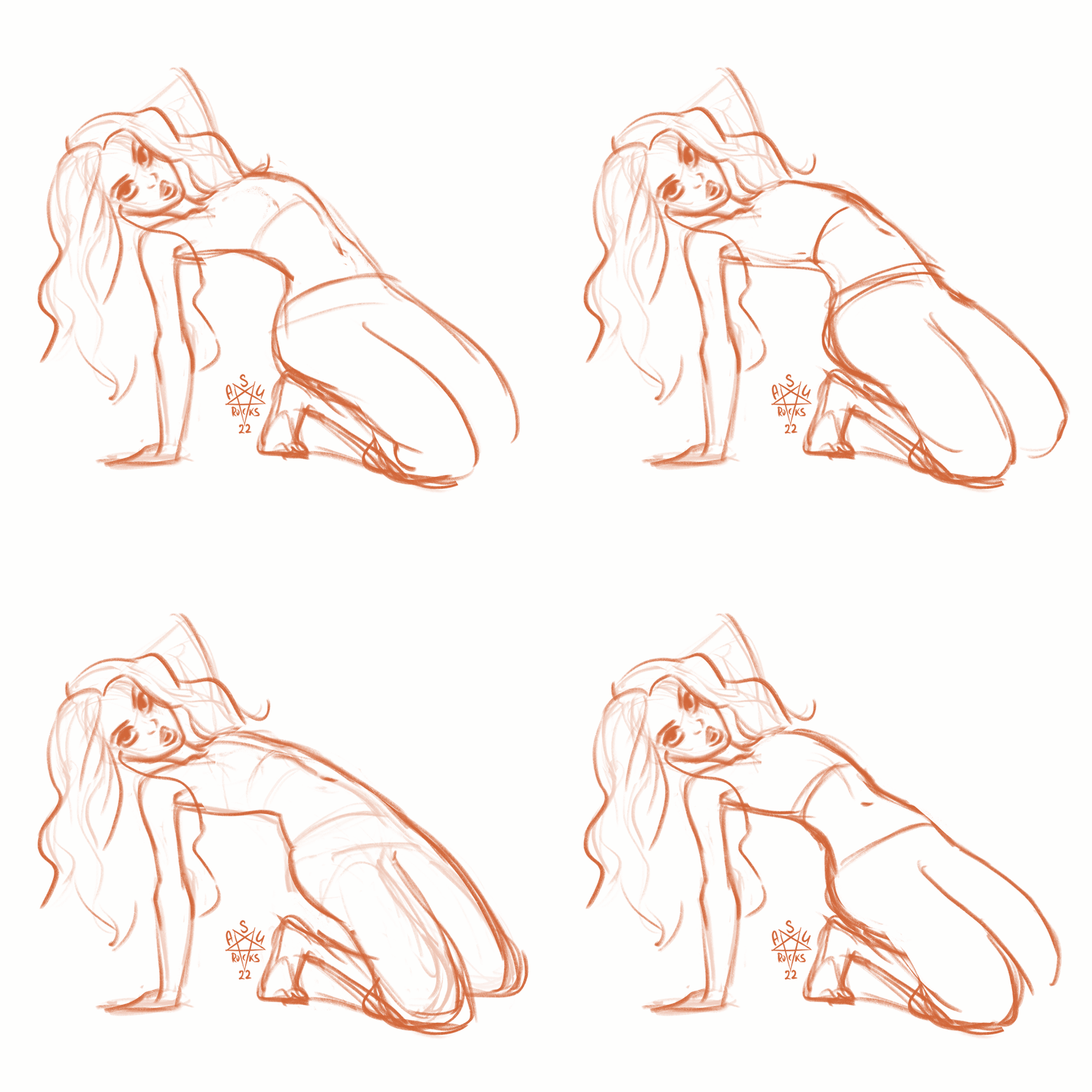
Thank you for reading!
❤ Asu Rocks
[/ppp_patron_only]


